UI / WEB DESIGN · 2023
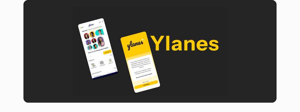
YLanes
Designing a web home for a mobile-first conversation platform — without losing what made it feel alive.
01 The Design Question
A candid-conversation app, already live on iOS and Android, needed to exist on the web.
02 Three Key Decisions
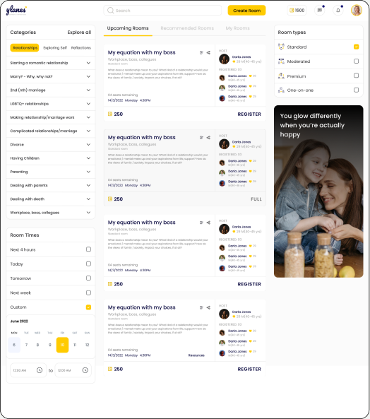
Put the filters in front of the content, not behind it.
Most community products bury filtering in a dropdown and lead with a feed. I gave categories, room types, and time windows their own persistent columns, level with the rooms themselves. On YLanes, what you're willing to talk about is the navigation — someone looking for rooms on grief shouldn't have to dig through the same UI as someone browsing relationship topics.
Trade-off: the page is heavier than a typical feed. That's the right heaviness — it reflects that choosing a room is a real decision, not a simple scroll.
Make people write something before they can register.
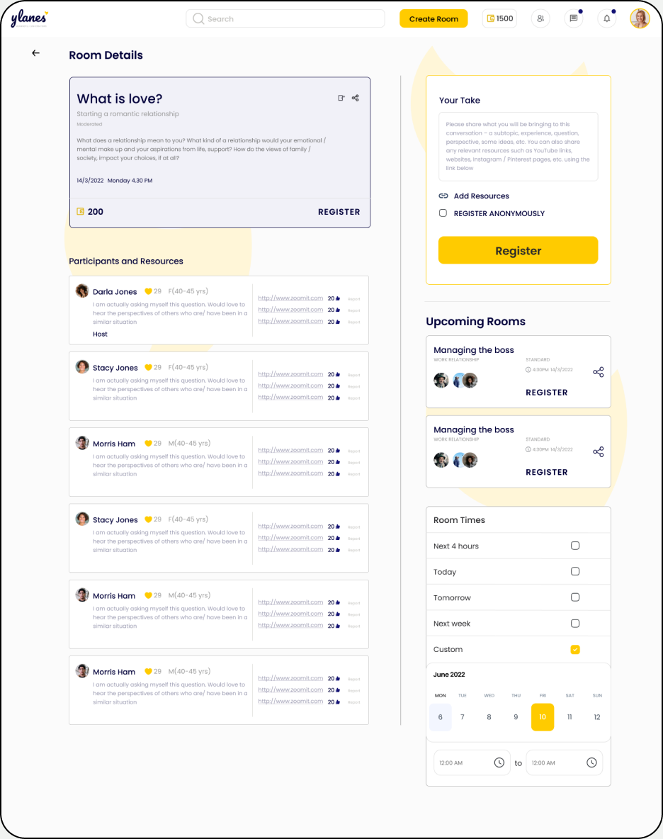
The “Your Take” box isn't optional. Before you can join a room, you have to say what you're bringing to it — a question, an experience, a resource, a perspective. Visually, I gave it a yellow outline and the full right column, so it reads as the primary action on the page, not a form field. The Register button sits inside it; you can't get to one without the other.
Friction as a filter: if someone won't write two sentences about why they want in, they're probably not the person the room needs.
Show that the conversation is temporary. Don't hide it in settings.
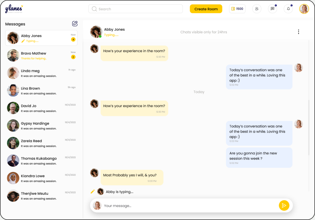
YLanes messages disappear after 24 hours. Most products would treat that as a backend policy and never surface it. I put “Chats visible only for 24hrs” centered at the top of every thread — not as a warning, as a frame. It changes how the UI feels: you're not writing into an archive, you're writing into a moment. The typing indicator, the soft yellow message bubbles, the lack of reactions — all of it reinforces that nothing here is being kept.
The product's disappearing messages was the concept. Surfacing it honestly in the chrome was the design call.
03 Brand & System
Web patterns pull toward dashboards — density, persistence, performance. YLanes needed to feel like a living room instead.
04 The Rest of the System
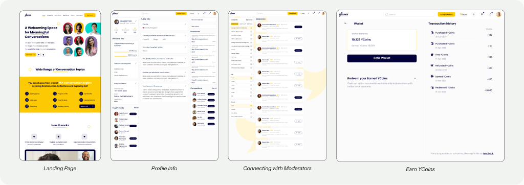
Landing page, profile, connecting with moderators, earning YCoins — the supporting flows that hold the product together.
05 Reflection
The hardest part wasn't the screens — it was resisting the pull of web conventions.